The Psychology of Colors in Interior Styling
Color is not just a visual element in interior design—it is an emotional language. It has the power to influence mood, behavior, perception, and even how we experience a space. The right color palette can transform a home into a sanctuary of calm, a hub of energy, or a statement of luxury.
In modern interior styling, color selection is no longer based solely on trends or personal preference. It is deeply rooted in psychology, functionality, and spatial experience.
In this blog, we explore how colors impact interiors and how you can use them strategically to create spaces that feel both beautiful and purposeful.
1. Understanding Color Psychology in Interiors
Every color evokes a specific emotional response. When used correctly, it can enhance the purpose of a room.
For example:
- Some colors calm the mind
- Some energize and stimulate
- Others create warmth and intimacy
Interior designers carefully choose colors based on:
- Room function
- Natural light availability
- Space size
- Desired mood
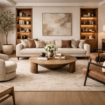
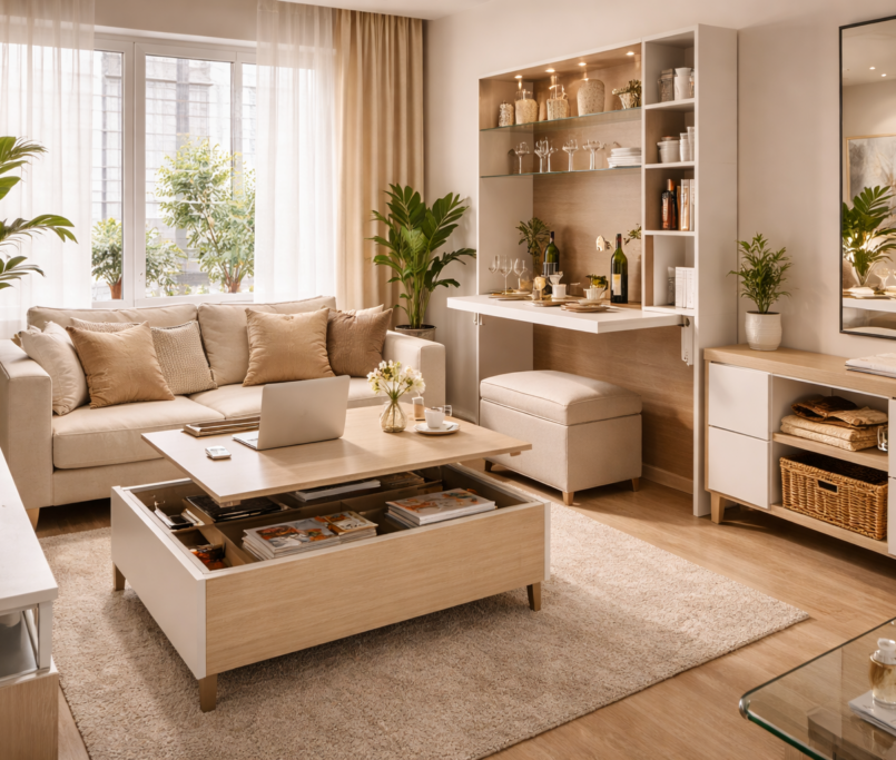
2. The Power of Neutral Colors
Neutral tones are the foundation of luxury interiors.
Popular neutrals:
- White
- Beige
- Grey
- Taupe
Psychological Impact:
- Creates calm and balance
- Reduces visual stress
- Makes spaces feel larger and cleaner
Why designers love neutrals:
They act as a blank canvas, allowing textures, furniture, and accents to stand out beautifully.
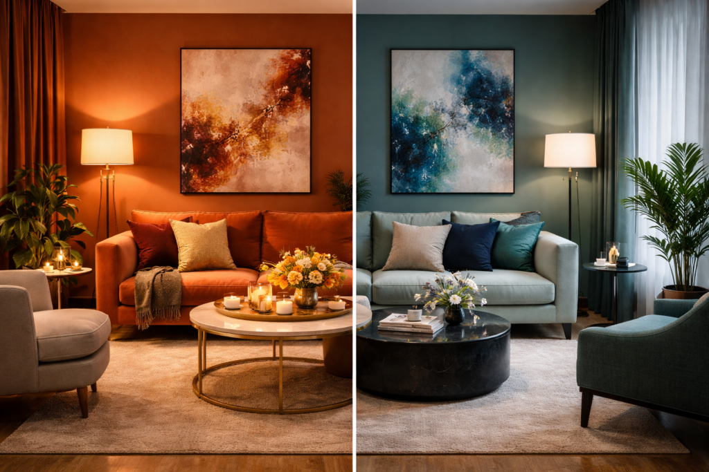
3. Warm Colors: Energy & Comfort
Warm colors bring life and vibrancy into interiors.
Examples:
- Red
- Orange
- Yellow
- Terracotta
Psychological Effects:
- Increase energy levels
- Stimulate conversation
- Create warmth and coziness
Best used in:
- Living rooms
- Dining areas
- Social spaces
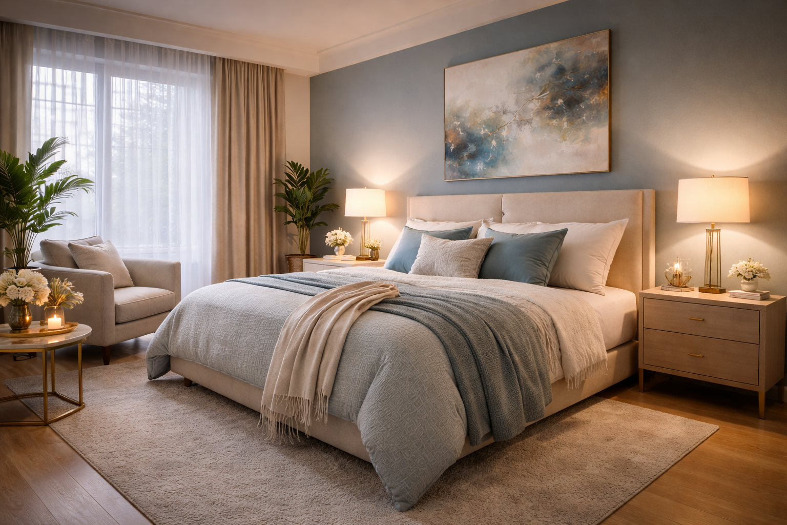
4. Cool Colors: Calm & Relaxation
Cool tones are perfect for creating peaceful environments.
Examples:
- Blue
- Green
- Lavender
Psychological Effects:
- Reduce stress
- Promote relaxation
- Enhance focus
Best used in:
- Bedrooms
- Bathrooms
- Study areas
These colors are essential for spaces meant for rest and recovery.
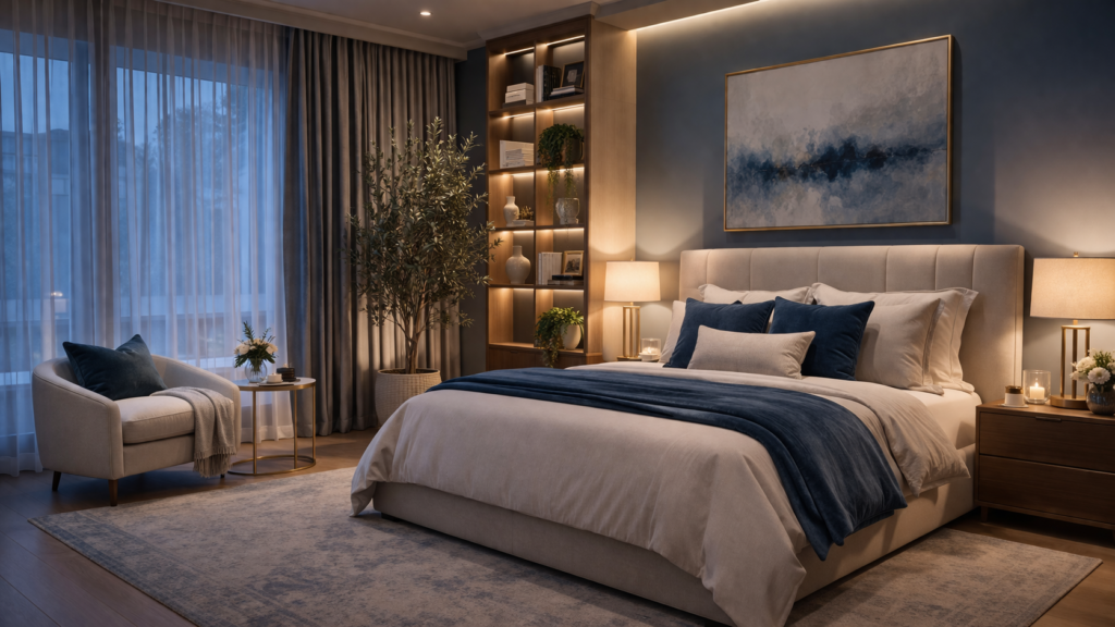
5. Dark Colors: Depth & Sophistication
Dark shades are often associated with luxury and elegance.
Examples:
- Charcoal
- Navy blue
- Deep green
- Black
Psychological Impact:
- Adds depth and drama
- Creates a cozy, intimate feel
- Reflects sophistication
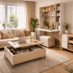
6. Light Colors: Space & Openness
Light colors are ideal for smaller spaces.
Examples:
- Soft pastels
- Off-white
- Light grey
Benefits:
- Reflect more light
- Make rooms feel bigger
- Create an airy atmosphere
Perfect for compact homes and modern minimal interiors.
7. Accent Colors: Adding Personality
Accent colors bring character to a space.
Ways to use them:
- Cushions
- Artwork
- Rugs
- Decor pieces
Why they matter:
They break monotony and add visual interest without overwhelming the design.
8. Monochromatic vs Contrasting Palettes
Monochromatic:
Using different shades of the same color
- Elegant
- Minimal
- Cohesive
Contrasting:
Combining opposite colors
- Bold
- Dynamic
- Eye-catching
Choosing between the two depends on the vibe you want to create.
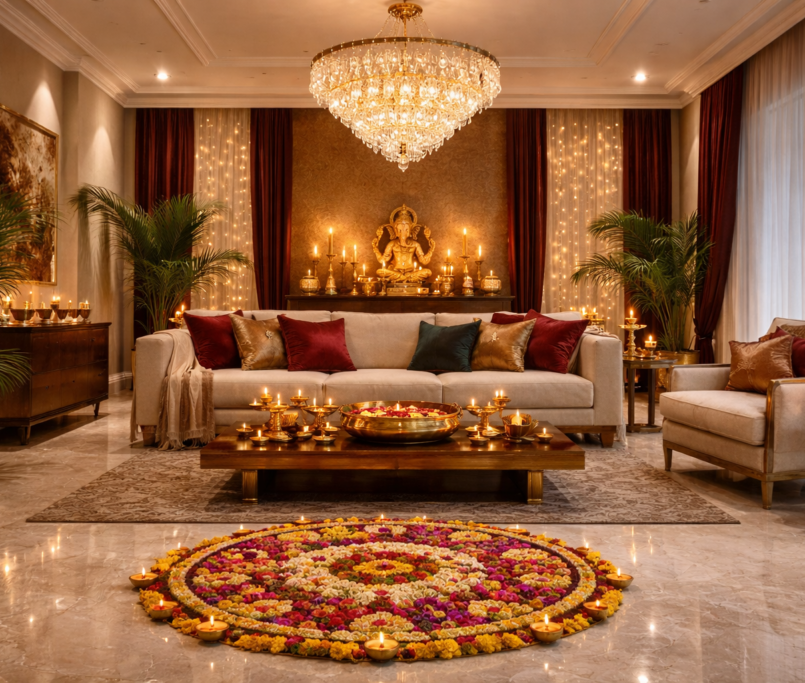
9. Cultural Influence on Color Choices
In Indian interiors especially, colors carry cultural and emotional meanings.
Examples:
- Red → Celebration & prosperity
- Yellow → Positivity & spirituality
- Green → Harmony & growth
- White → Peace & purity
Understanding cultural context helps create more meaningful spaces.
10. The Role of Lighting in Color Perception
Lighting can completely change how a color looks.
Types of lighting:
- Natural daylight
- Warm artificial light
- Cool LED light
Important:
Always test colors under different lighting conditions before finalizing.
11. Color Zoning for Functional Spaces
In modern homes, color can be used to define zones.
Examples:
- Soft tones for relaxation areas
- Bright tones for workspaces
- Warm tones for social zones
This helps in creating a structured and purposeful interior.
12. Trending Color Combinations in Luxury Interiors
Current high-end trends include:
- Beige + Gold
- White + Wood tones
- Grey + Pastel accents
- Black + Metallic finishes
These combinations create a balanced and premium look.
Final Thoughts
Color is one of the most powerful tools in interior design. It shapes not only how a space looks, but also how it feels.
By understanding color psychology, you can:
- Create emotionally balanced spaces
- Enhance functionality
- Elevate aesthetics
- Reflect personal style
The key is to strike the right balance—between bold and subtle, warm and cool, modern and timeless.